Summary
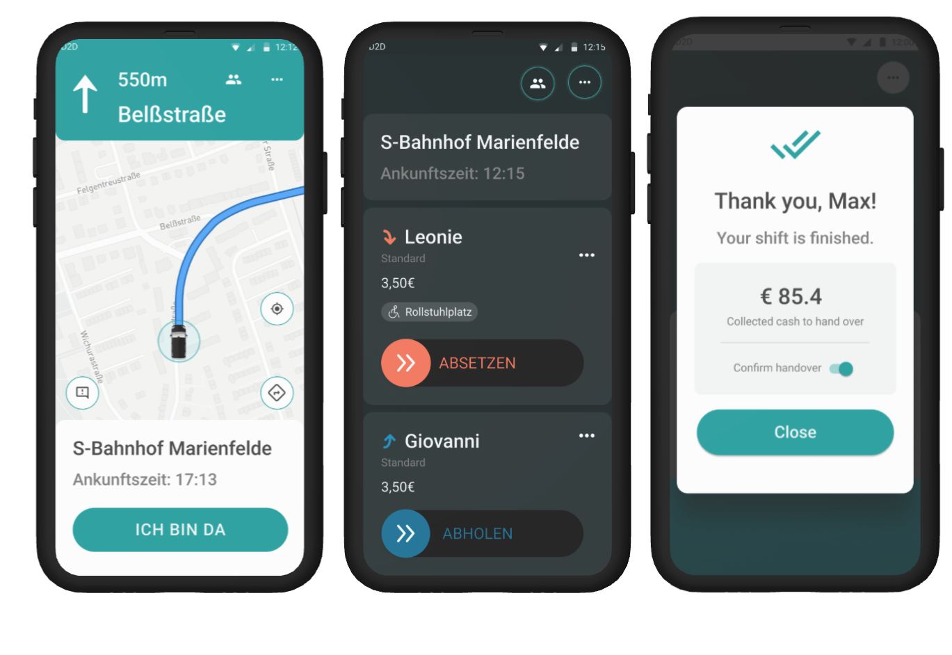
- I have designed a new Driver App for the ridepooling service — reworked an MVP from the ground up: the new app fulfilled company strategic goals, satisfied the needs of the drivers, eliminated tech and UX debt.
- The research phase was informed by driver interviews and surveys, business stakeholder conversations, industry standards for automotive interfaces, and me driving multiple hours in a driver role.
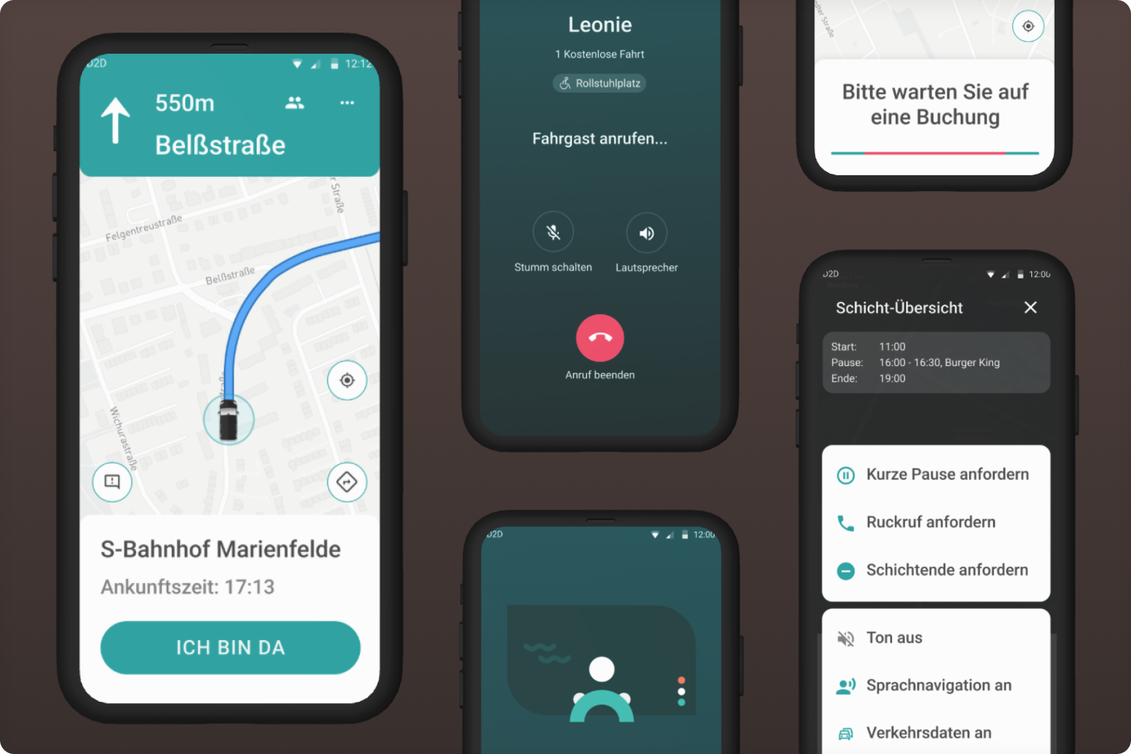
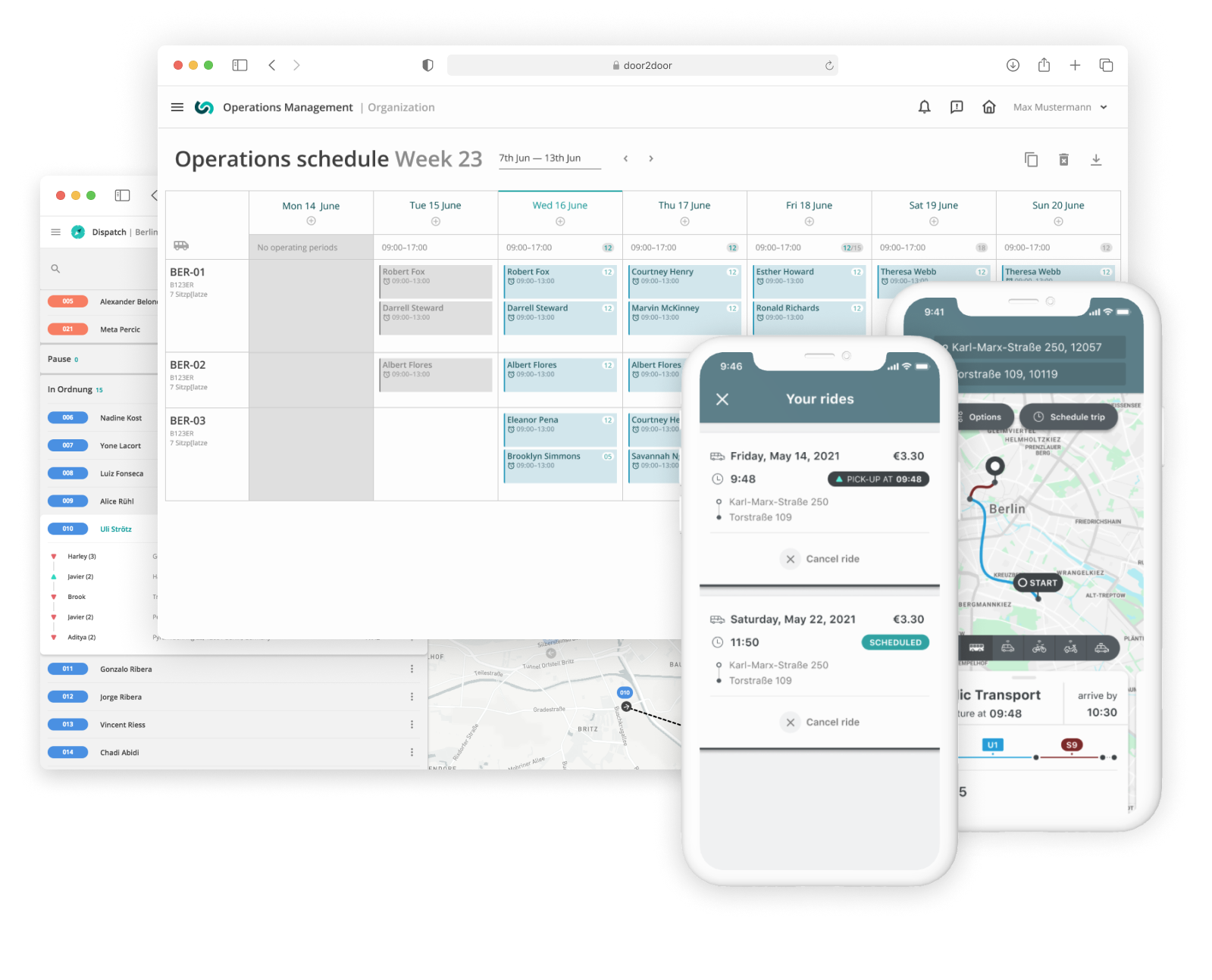
- In collaboration with engineers, I have developed a new design concept, which integrated important new features such as built-in navigation and voice calls to passengers.
- The new app unlocked new business opportunities, reduced on-trip driver distractions by >50%, subsantially improved safety, and reduced driver turnaround due to better satisfaction at work.


Challenge
In a ridepooling service, a driver app provides an interface between the digital — an algorithm that decides which passengers should be picked and where — and a human who spends hours in a driver seat, meeting passengers and carrying them to the destination point.
When I joined the team, the driver app already existed. But the drivers complained a lot, and it was not clear how the long list of features that should unlock new market segments, can be integrated into that app due to the way it was organized.
My task
Identify and eliminate pain points of drivers, redesign the experience, interface and internal structure of the app in a way that would solve known problems and unblock new business-critical features.

Being in the driver context was immensely helpful in understanding the pain points.
Solution discovery
After some domain research and first empathetic exercises, which involved using the app while driving the car and sitting behind the wheel, I wrote down principles that should apply to such interface. In fact the app has a lot in common with built-in car interfaces, where safety of the driver and the passenger comes first:
- When the vehicle is moving, the primary focus of the driver should be on driving. All other screens are secondary to windscreen.
- The driver should not have to change the posture to use the app. The app should provide enough legibility from a distance of ~ 1m.
- While driving, the physical controls work better as they can be manipulated without looking at them. But since we cannot provide physical controls in the app, the controls that are used while driving should be should be large and should prevent accidental interactions due to a shaking vehicle.
- Even when not driving, the driver may have a high cognitive load because of the routine tasks they may have to do at the same time: finding the passenger or resolving a conflict. To reduce the load, the app should deliver only the important contextual information at all times, and never actively ask for driver attention unless absolutely necessary.
The design process included several loops of research, ideation and validation, during which I have:
- Gathered knowledge about existing industry standards: vehicle human interface guidelines (like Google Design For Driving),
- Figured pain points and goals by interviewing drivers on several installations across Germany,
- Mapped interconnected userflows to visualise driver journey including interactions with passengers and dispatchers
- Created Figma prototypes, and collected driver feedback on them,
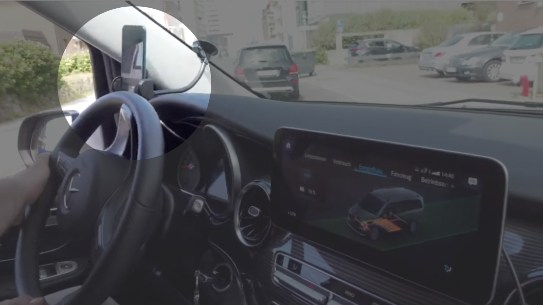
- Drove the vehicle and used an app myself in the real context, as we ran a weekly test installation of the service
As I was iterating on the concept, I worked in close contact with Android engineers, validating the UX and co-designing application's technical structure.
The new concept included both structural and interface improvements as a result of my contribution:
- Reworked user flow that included seamless built-in navigation instead of triggering Google Maps app,
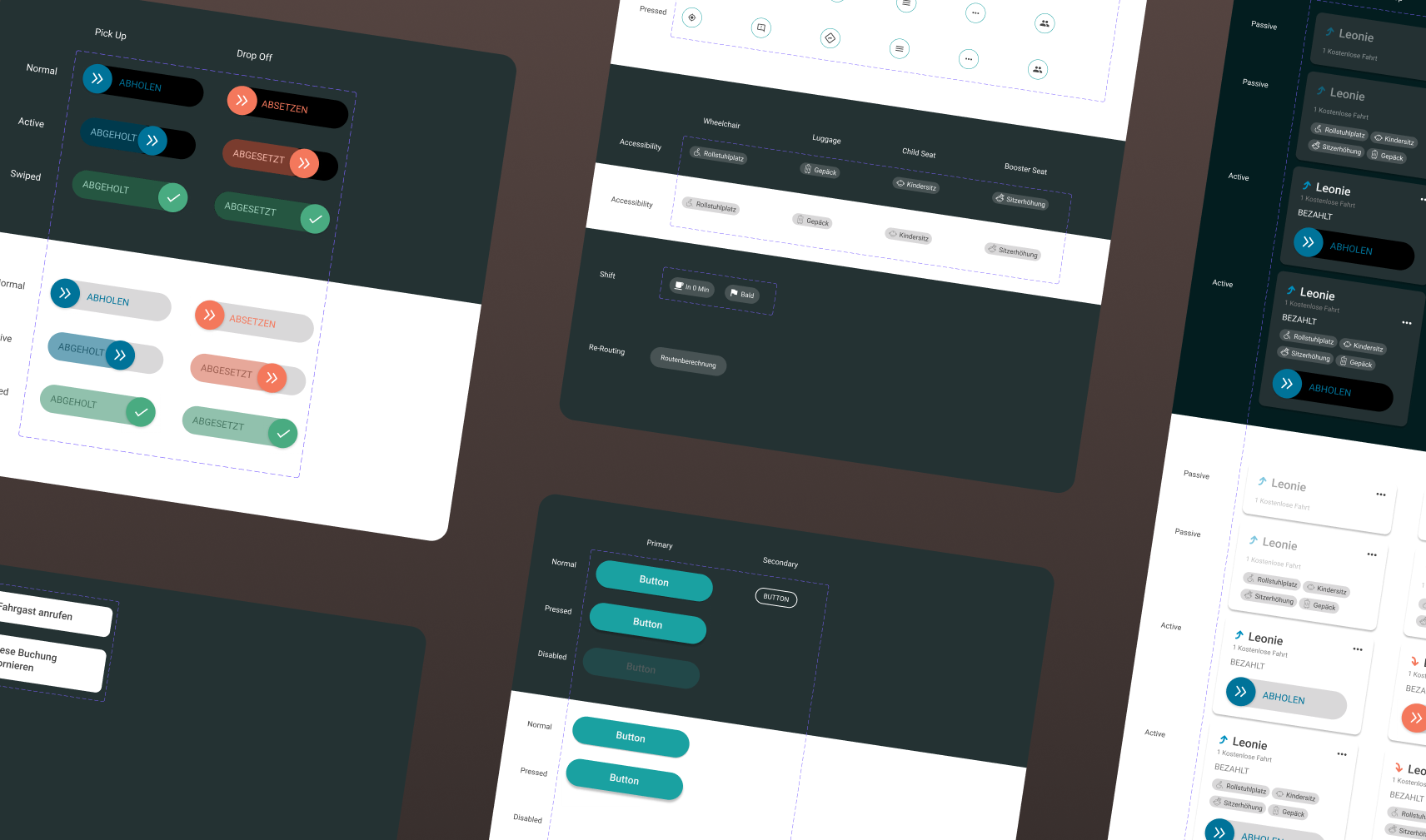
- Better legibility and contrast. I have introduced a new typographic grid with larger base values to make text readable from the driver's seat,
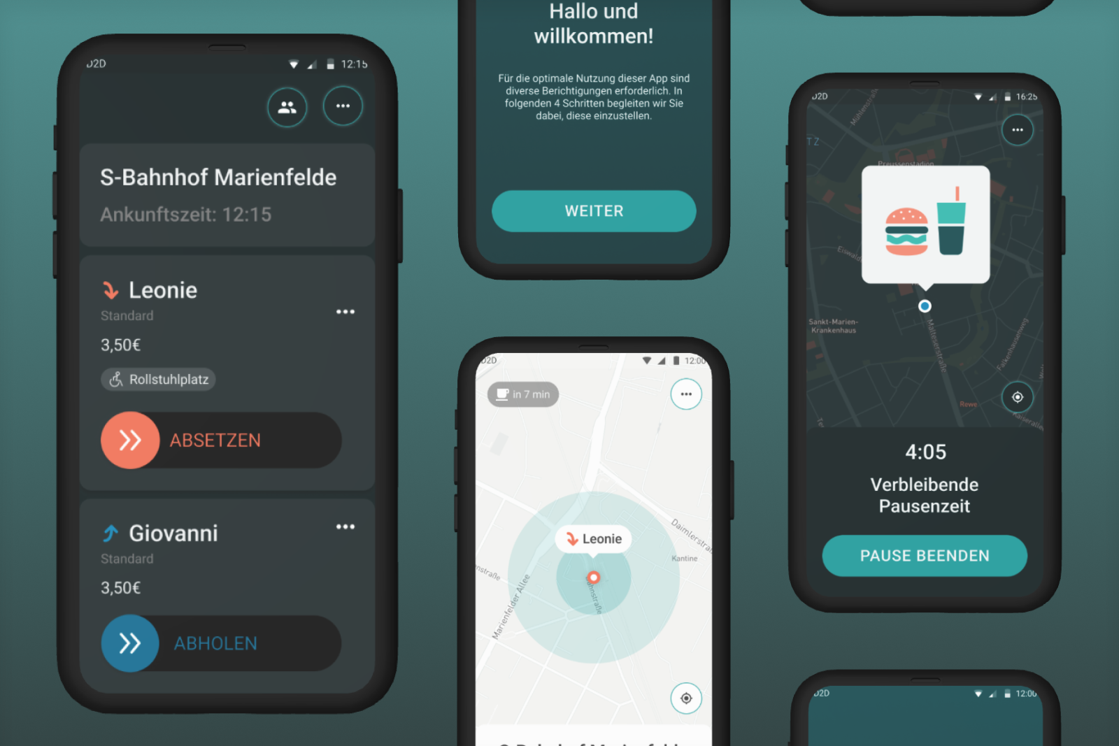
- Light and dark mode. Reducing eye strain and better legibility,
- Swipe gestures instead of button taps to avoid accidental butting triggering,
- Delightful interactions to soften "emotional dips" in the user journey,
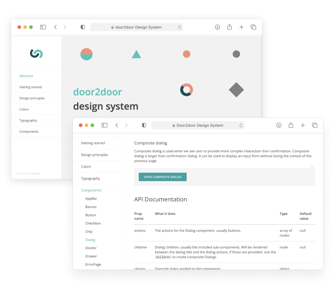
- UI patterns, elements and microinteractions documented in Figma library

UI Kit: enlarged typography and interaction elements for streess-free interaction when the phone is fixed to the car dashboard.
Results
- On-trip app interactions minimised by at least 50%, enhancing safety for both passengers and drivers
- Dramatically reduced number of UX-related support tickets
- New business cases opened due to an upgraded scalable UI architecture
- Positive feedback from drivers and dispatchers about more efficient workflows
Learning outcomes
- Never underestimate context. Collecting driver feedback, I have initially seen some of their pain points as having little priority, until I put myself behind the wheel. This radically changed my perspective on the kind of problems these people are facing, and the changing context on the road. No empathy exercise in the office chair can come close.
- Importance of real world testing. Changing road conditions, blocked traffic, disconnecting cellular data — field testing of the prototypes opened new corner cases and gave amazing insights. Such an app can not be tested in isolation, but investing effort in modeling the context for real world tests has totally paid off.
- Establishing a close communication loop with engineering, and understanding of internal architecture makes space for great design solutions.
