Challenges designing a mobile music streaming app
Pivoting a music service from collectors focus to casual listening.
Pivoting a music service from collectors focus to casual listening.
My role in this project was a crossover between design lead and product manager. I had to articulate tough decisions, while seeing the product from multiple angles. I gathered experience in UX strategy and product roadmaps. Together with the analytics team we worked to define the active user in a mixed audience. While I was leading the product design, a company grew from 20 to 50+ people.
This app has changed the concept and proposition of the whole Zvooq service. Previous products, Zvooq website and Fonoteka mobile app, facilitated a closer connection between users and their favorite music. The new concept was focused on background casual listening and mass-market audience.
Music as entertainment. Casual listeners do not take music too serious. Music is serves more like a background for daily routine. Popular hits are important part of it.
Music companies influence user preferences. It’s not a secret that music business companies control not only production, but also publishing and marketing to create anticipation around the music they want to be popular.
Low level of social network integrity. In Russia, not counting big cities, most people do not have social connections outside their real life circles. As a result, social music discovery will not work for these users.
Acceptance of advertising. Habits of watching TV and listening to commercial radio make these users more loyal to ad-supported streaming.
Pirated music is big in Russia, and it still makes a competition to legal services. Therefore, many users are not ready to pay anything for access to music. To make the service valuable for them, Zvooq app was made with a free tier allowing ad-supported streaming. Paying subscribers would get offline syncing and abilitu to stream ad-free.
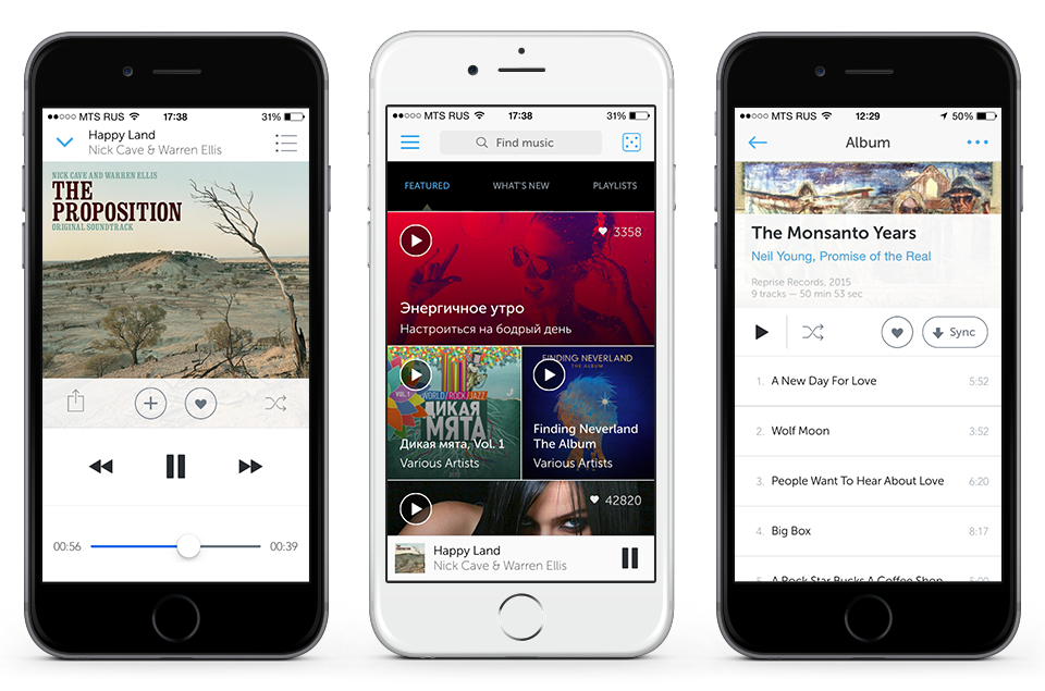
Zvooq app, unlike Fonoteka, needed proven inteface paradigms and obvious interactions. It's an app for masses, so, speaking of features for MVP, users should be able to discover albums and playlists, save music to collection, sync offline and share outside. Radio functionality and social features were planned next.
One of the first decisions I made was about the discovery feature. We rejected a friend feed in favor of editorial content.
Zvooq first went live on web and became popular with creative professionals, an highly interconnected social group. After successful Facebook integration the service vent viral. In a short time we acquired a good number of socially active users. It was 2011, the year when Spotify got the US audience via Facebook integration.
This dynamic spoiled our vision. To push social music further, we explored and prototyped shared playlists, peer-to-peer playback, and online music chatrooms. We were sure that social discovery should be the main driver the mobile app, and we started designing a social feed. First friends, artists and labels, and later including influencers and curators.
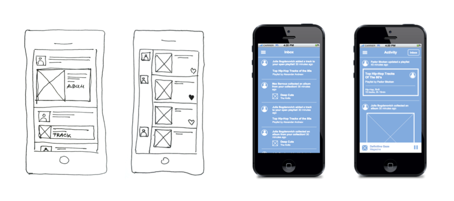
Social feed concepts
We looked at the data on our existing users. Surprisingly, many of them were not active on any social network. Even if they had an account, they did not have friends. These users would see an empty social feed. Fail.
Unlike that, a featured content feed would work for all users on the first contact. I suggested using hybrid technology (HTML+native) to get flexibility for the future until we find the right patterns.
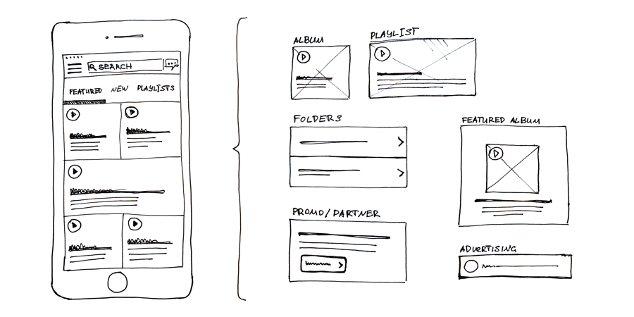
This kind of grid could easily fit different types of music and non-music objects: albums and playlists, nested folders/lists, special offers, partnership promotions, and advertising.
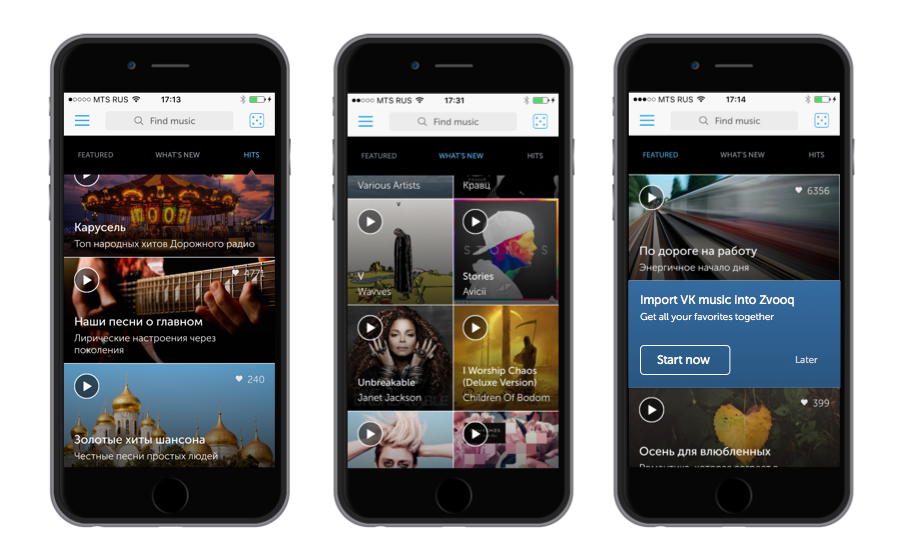
With this design we could immediately show variety and accessibility of music. Even without personalization it was a solid starting point.
The data showed that if a user has synced music on the first session, he or she are likely to open the app again. There would be something to return to, and we wanted to increase the number of returning users. Even if users arrived to the album screen through features or search, they sometimes did not understand how to download music.
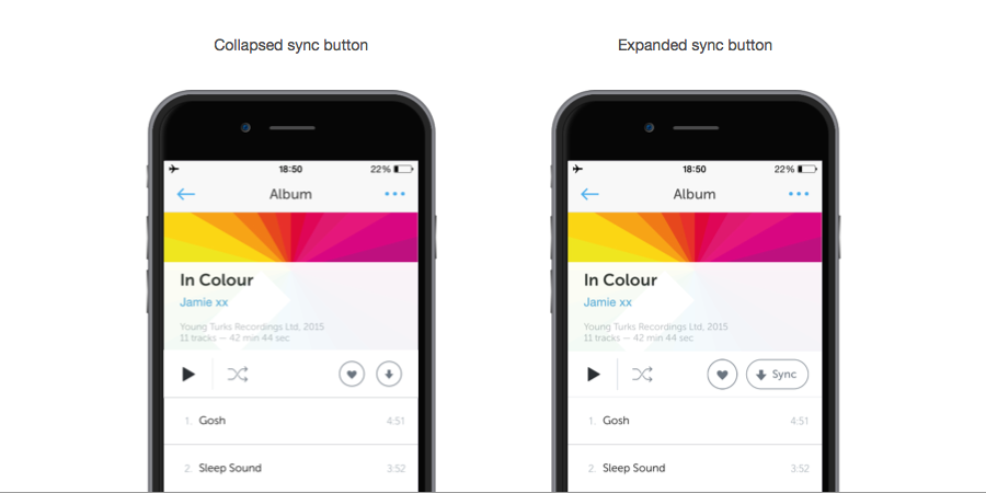
I have slightly changed the hierarchy of buttons on the toolbar, added the text label to the sync button. Syncing became obvious. After a few successful downloads, the button was supposed to shrink back to a collapsed state, freeing up space.
Every app designer needs to know who are the core users of their product. These are not users who installed the app or successfully completed the registration. I prefer to define “real active users” as those who use the product the way it was supposed to be used. These users are the most valuable resource and the reason that justifies the existence of the product.
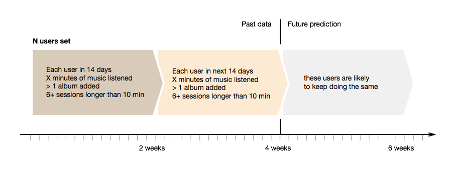
Since Zvooq went freemium, economically there were two types of users: paid subscribers and those on the free ad-supported tier. But just the fact that users is paying for the subscription does not mean we see the active user. The most important is what they do in a given period of time. If they demonstrate repeating usage patterns during a given time slot, and these patterns include enough desired actions, we can count them as active users. For these users we can predict, with a certain probability, that they will repeat the same behaviour during the next time slot.
* not real numbers
For example, a user can be considered active if he has listened to X minutes of music in 14 days, and in the following 14 days the same user has listened to 0.9*X or more minutes. In this case we can predict that this user will not leave the service within the third 14-day slot. We can get a sharper definition if we add another activity to the equation: adding music to collection. Or we can count the number of sessions AND number of collected albums AND the total number of minutes listened.
The dynamic of the active users is the most important product indicator. If the number us active users is growing, the product is moving in the right direction. From here we also can calculate different groups of users and investigate their activities. For example, If we calculate the difference between the set of paying subscribers and the set of active users, we can research the data further and understand why subscribed users stop actively using the app. They have not left yet, but there’s a chance they will. We can adjust to keep them in the app.
I can provide some additional details of this project by request. Let me know.
I was working on this app for two years since 2013 until 2015. During this time the product transitioned into scaling and monetization stage, and the company tripled in size. As a designer, I learned how to protect user experience and maintain a balance between product and business goals. It was a reality check which improved my communication skills and broadened my scope.
I learned how to manage the experience and features across platforms. We were developing the app for iOS and Android. Usage patterns, habits and expectations of Android users are not exactly the same as those of iOS users. For example, Apple ecosystem educated users to paid apps and subscriptions, while Android users are not so much prepared to pay for software and content. Sometimes it's reasonable to have a different set of features or different priorities between platforms.